Walk into any zine fair in the last five years and the smell arrives before the tables do: soy-based ink, slightly sweet, drying on newsprint stock. That smell belongs almost exclusively to the risograph, a Japanese duplicator built for church bulletins and PTA newsletters that independent publishers have quietly turned into the defining print texture of the DIY decade.
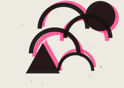
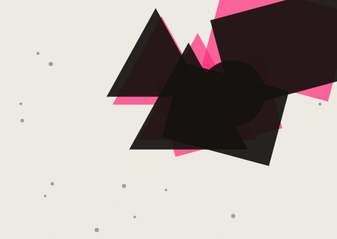
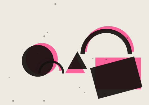
A risograph prints one colour per pass, through a stencil wrapped around an ink drum, which means every riso print carries a small, honest flaw: registration that drifts by half a millimetre, ink that pools slightly heavier at the edge of a shape. Offset printing spent a century trying to eliminate that drift. Riso culture inverted the value, and made the drift the point.
“A riso misprint isn't a mistake. It's the machine telling you it was actually there.”
We spent an afternoon in a print studio that runs four drums in rotation — fluorescent pink, cobalt, black and a custom-mixed yellow — watching a printer named Ilya register a poster by eye, one layer at a time, checking each pass against a lightbox. There is no software step here that can shortcut the patience. You either learn to see half a millimetre or you don't.
What makes the format matter beyond nostalgia is what it does to a picture. Because each colour is a separate physical pass, illustrators working in riso learn to think in flat planes and deliberate overlap rather than gradients, and that constraint has pushed a generation of self-published artists toward a bolder, more graphic visual language than screens ever asked of them.
Ask anyone running a riso studio out of a spare room why they haven't switched to a laser printer with a duotone filter, and the answer is never really about cost. It's about the machine leaving a fingerprint that software can imitate but never quite earn.